|
Correcting Problems With Text Features
In last months Pro/E tip (February 2000) we discussed several aspects of using the
new true type fonts of 2000i. As promised, this months tip is about solving some of the problems with creating
solid geometry using the new True Type fonts.
 |
| Figure 1 |
|
 |
| Figure 2 |
|
To illustrate some of the issues and one of the work-arounds, we'll use a simple example of putting text on a
solid. The solid shown in Figures 1 & 2 is curvaceous for illustrative purposes, but the same example
will apply to a flat or rounded face of a solid.
To get the most out of this Months Tip, we strongly suggest that you build a model and
work through the steps as we go along.
Starting with this solid, (or any other solid you want) put the desired text in the model as a Datum Curve
feature (see Figure 2). In this example, the text is "Blueprint MT" at 75 height. (Note: this particular
example is a metric (mm) model, but it will work for any size or units.
(See the tips of February 2000, March 1999 and
January 1999 for more information about creating and working with text.)
To add the text to the solid, the datum curve is referenced in Sketcher using Geom Tools > Use Edge >
Sel Loop. One entity of the letter "S" is selected, and the "loop" is automatically gathered to complete
the "S". The feature is then completed and the "S" appears on the solid as shown in Figure 3. (Red color
on the letter surfaces added.)
 |
| Figure 3 |
|
Next, the "t" is created in the same way as the "S" above. Looking at the model in wireframe, there is no
indication of problems, but OOPS! when the model is rendered, there is a very
strange behavior that appears. It's like a shaded surface that can be viewed from only one side! It
appears to cut through the model when viewed from one angle, but doesn't appear at all when viewed from
another.?.
(I've often wondered if this is a "one sided surface" mentioned in some of the bazaar error messages Pro/E gives.?.)
So, what is the problem here?
What causes this obnoxious behavior?
Take a look at Figure 4. If you zoom in deep on the end of the cross of the "t" you will see an
anti-tangent condition (shown in the inset circle). This is really difficult geometry to create, hence the
obnoxious behavior of the Pro/E model.
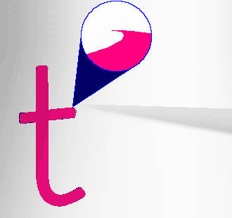 |
Figure 4 |
|
How do we fix this? One way is to use a different font. As suggested
last month, the Font3D is the most robust, but if you really need the particular
font chosen, you can return to sketcher and repair the problem area.
 |
| Figure 5 |
|
Figure 5 shows a highly zoomed in view of the problem area in sketcher. The segment between the red
dots is the degenerate piece, so it must be replaced. This is done by deleting it and
sketching a new "replacement" piece.
Note: This is not easily done using Geom Tools > Replace.
Though it will work, it can cause headaches in getting the tangencies of the new spline set
correctly because sketcher may assume tangencies to the degenerate segment, then when you replace it, the tangency
condition will no longer exist and you will have to rebuild it. In short, it's just easier to delete the
degenerate segment then sketch a new spline.
 |
| Figure 6 |
|
In Figure 6, the new segment is shown -- note the datum curve of the original text still appearing in the tan
color. To create the new segment, First, 2 centerlines are sketched and constrained as tangent to the end
points of the existing remaining curves. Second, a spline is sketched with tangency defined at both ends
(Sketch > Advanced Geom > Spline > Both). If angles are required, they need to be set at 180 degrees.
Once the degenerate piece is deleted and a new piece inserted, the feature can be completed. Figure 7 shows
the new "t" in now good geometry.
 |
| Figure 7 |
|
For a fun little exercise, try creating the "t" directly as a solid. In the above example, the "t" was first
created as a datum curve, then as a solid. If you create the "t" as a solid by its self,
will it have the same degenerate geometry?
Actually, when you look at the sketched "t" in sketcher, the geometry looks good. There is not any weird
stuff like the little anti-tangent condition shown above. However, the resulting geometry will be just as
degenerate as with our example above. Why?
Now the final BIG question ... Why can't the geometry of a sketched solid "t" be
corrected like in the example above?
We offered recognition to anyone who could answer the question ... Too bad we did not have any winners - for
that matter, we did not even get any answers sent in. Was the question too hard? or was everyone
afraid to play?
Answer: The sketched text is a single sketcher entity so you cannot manipulate
small portions of it independently.
Thanks for visiting our Pro/E Tip of the Month
Have yourself a wonderful day!
 |
| Figure 8 |
|
UPDATE:
Pro/Engineer 2000i2 datecode 2000420 has been shipped in order to resolve the issue of unpredictable results when extruding
fonts. This functionality has apparently been resolved in 2000i as well with the datecode 2000410 or greater.
|